Explainer
Back
Estimating the marginal carbon intensity of electricity with machine learning
In this second article of our marginal emissions series, we document Electricity Maps’ journey of developing models to calculate marginal carbon intensity signals.

Olivier Corradi

This blog post is part of a series of articles uncovering all you need to know about marginal signals, discussing their challenges and why average emissions factors may be preferable. Find a simpler overview of the complexities to consider when using marginal signals in practice here.
The first article introduced the concept of marginal emissions factors and some of their complexities. In this second article, we document Electricity Maps’ journey of developing models to calculate marginal carbon intensity signals. While we keep this article online to show the complexities of developing reliable marginal signals, we no longer offer marginal signals due to their major limitations.
How do you know where your electricity comes from? The answer, in its simplest form, is given by the Electricity Maps app. However, when consumers are faced with a decision — for example deciding when to charge an electric vehicle —they would ideally need to know the impact of increasing grid demand.
In a theoretical and simplified scenario, additional electricity will come from the cheapest power plant that still has spare capacity at that time. This power plant is called the marginal power plant. Typically the marginal plant is a system that can react quickly to changes in electricity demand, such as a gas turbine. It however, cannot be a wind turbine or solar cells, as you can’t command them to produce more (unless you command the weather that is). In reality, the grid and its operations are more complex than this, though. Learn why here.
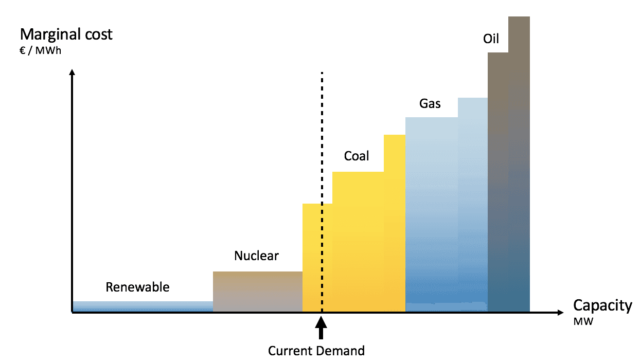
As a consumer, when you decide to charge your electric vehicle at a given time, you are causing the marginal plant to produce more, and therefore, are responsible for the carbon emissions associated to it. Those emissions are called marginal carbon emissions. It is the quantity that should guide our choice as flexible consumers. For example, it is better to charge your electric vehicle when a hydro dam provides the additional electricity, compared to when a gas turbines does (as the latter has much higher emissions). Note that long-term effects exist (e.g. the depletion of a hydro reservoir that would causes coal plants to supply electricity once it’s empty), but we here focus on short-term effects.
Traditionally, marginal carbon emissions were calculated using assumptions on what kind of generation would be marginal at a given time. However, we’d like to present an alternative: Instead of assuming what kind of generation is marginal, this article is about how we use machine learning to estimate the marginal origin of electricity, and thereafter deduct the associated carbon emissions. Let’s dive in!
The European electricity system is incredibly well connected. As a result, the marginal electricity might come from neighbouring areas. The first step is therefore to figure out which area will supply the additional demand.
At the core of the solution is a simple formula that states that any change of generation (or imports) that was historically observed can be explained by the sum of two components:
One which is independent of changes in electricity demand (wind production for example)
One which depends on changes in electricity demand (that’s the one we’re interested in)
This holds at all market and weather conditions (which we call situations depicted as z) and at all times.

The multiplier g(z) is the marginal factor in a given situation z. It represents how much the local generation (or import) X typically increases during a time interval when the demand increases by one unit during that same interval: it’s the marginal origin of electricity.
The Electricity Maps database has been collecting a tremendous amount of data in which these changes are observed across a variety of weather and market conditions z. The changes in generation (or import) dX are all observed in our data, together with the changes in local demand dL. We therefore simply need to estimate which situations z best separate the signal into a marginal and a non-marginal part, in order to extract the marginal factor. We will then be able to estimate the marginal origin of electricity in future known situations z.
The model is trained using our whole database of hourly data, using more than 1000 explanatory variables that together describe a whole range of various grid states (e.g. weather and market conditions). The model automatically selects the variables (situations) that best explain the observed data.
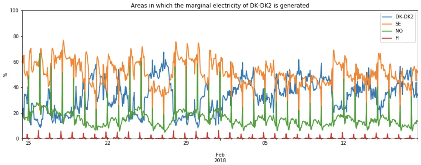
At the beginning of February 2018, our model estimated that the Eastern Denmark area (named DK2) procured roughly 80% of its marginal electricity from Sweden, the rest coming from local generation. This means that increasing demand lead (mostly) to higher Swedish imports.
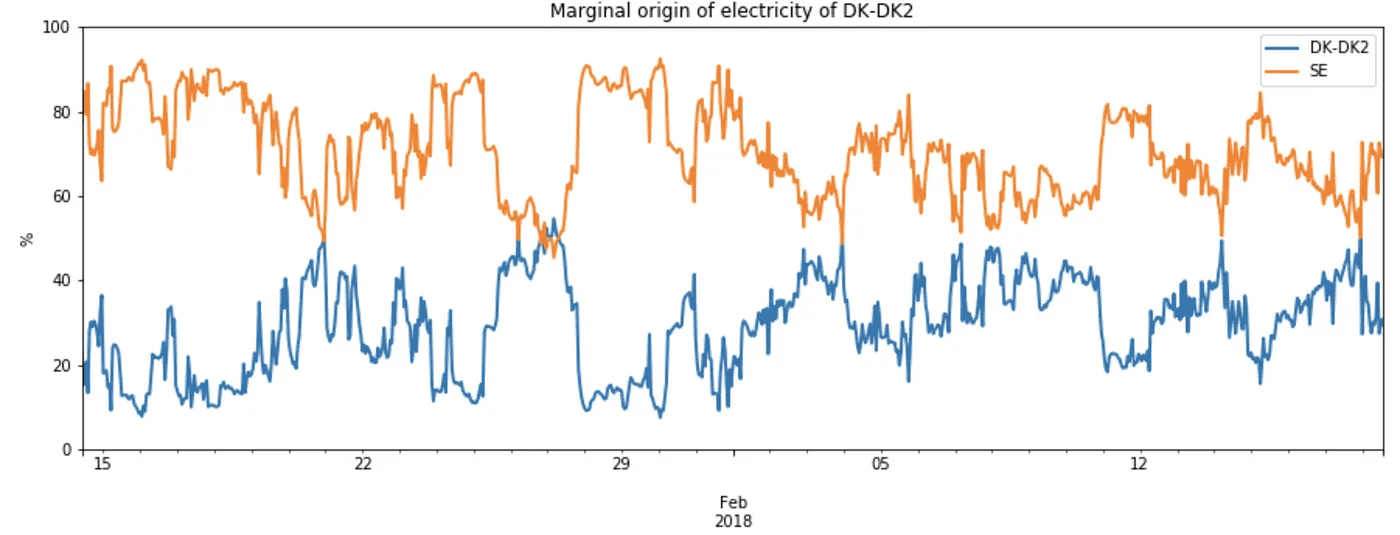
However, care has to be taken as Swedish electricity might not only come from Swedish generators, as Sweden is connected to both Norway, Finland, Poland and Germany. Furthermore, those might also in turn import from their neighbouring areas. As we’re interested in attributing carbon emissions, we need to trace back the area that generated the marginal electricity.
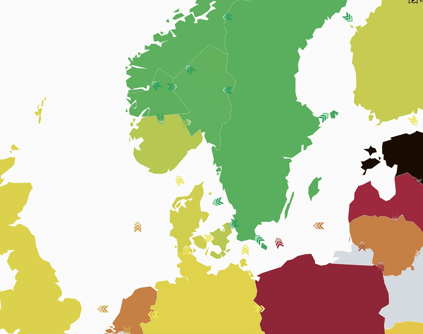
In order to figure out which area generated the marginal electricity, we will have to follow the chain of imports. This is called flow tracing. Here’s an brief outline of the methodology:
For all areas, we estimate where the marginal electricity comes from (is it local generation or imports from neighbours?)
Given that a marginal import from an area yields an increase in demand in that area, write out flow conservation equations (analogous to energy conservation laws). That’s one equation per area.
Simultaneously solve the system of equations in order to estimate, for each areas, the areas in which the marginal electricity was generated.
The final result is a matrix which we call the marginal topology matrix. Each row depicts which area generated which fraction of the marginal electricity of that row area. Here’s an example of how that matrix looks like at a particular time:
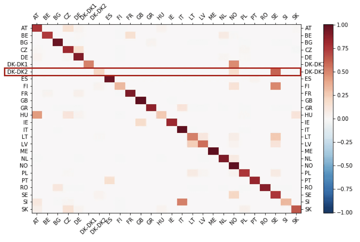
Around 80% of the marginal electricity of Eastern Denmark comes from Sweden. But because the Swedish marginal electricity is procured from Norway and Finland, a portion of the marginal electricity that came from Sweden was actually generated in Norway.
So far we’ve covered how we discover which areas generate the marginal electricity of a given area. Next, we need to estimate what generation type (hydro, gas, coal…) was used to generate that marginal electricity. From there we will be able to estimate carbon emissions.
In order to estimate which generation type is used to generate an additional unit of electricity, we will re-use the formula used in the previous step by changing the two following elements:
The changes in generation (and imports) dX, are replaced by changes in generation of each generation type.
The change in demand dL is replaced by the change in local generation.
This enables us to estimate what type of generation unit is used to generate an additional unit of electricity. This is calculated for each area. For example, Eastern Denmark generates an additional unit of electricity using mostly coal and gas:
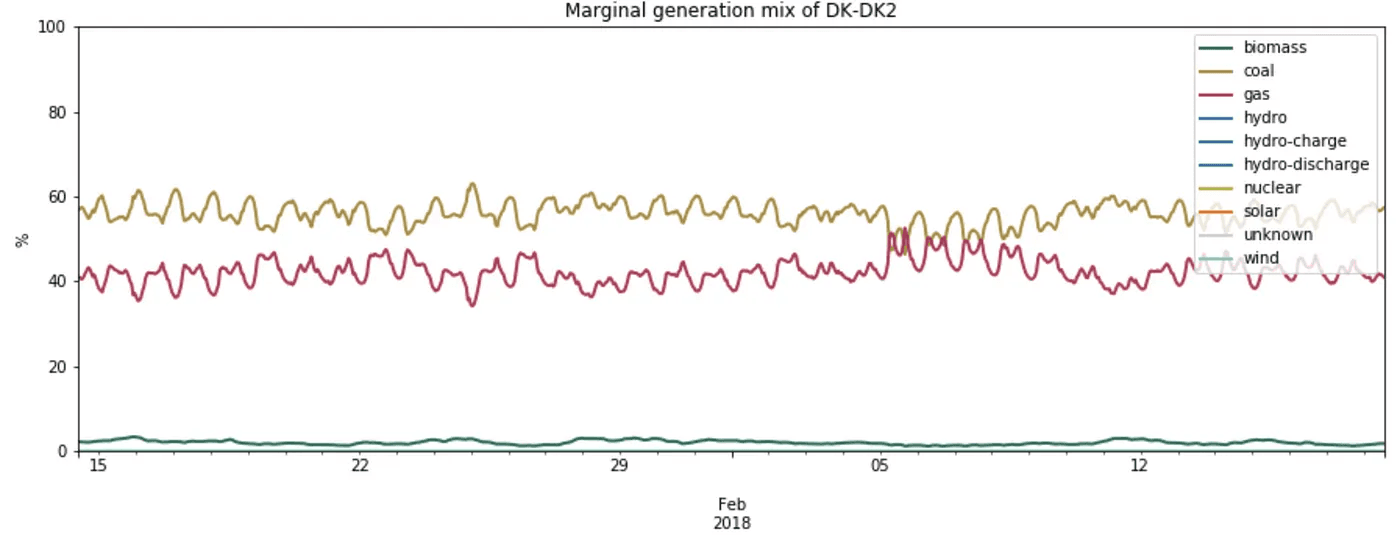
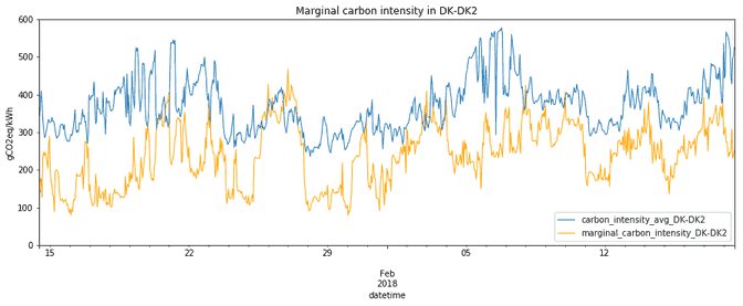
Using the IPCC emission factors for each power plant type, we can infer the emissions from marginal generation in Eastern Denmark, which are slightly under 700gCO2eq for each additional kWh generated. This carbon intensity is rather stable over time as the marginal generation mix is rather stable as well.

Marginal emissions of Eastern Denmark come both from emissions of local generation as well as marginal imports from Swedish and Norwegian areas (see previous section). The total marginal emissions are therefore computed as the weighted average of the generation emissions of those 3 areas, using the percentage of origin as weight:
What about other areas?
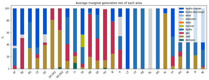
Here’s how, on average, each area generates its marginal electricity:
and here are the associated emissions of generating an extra unit of electricity:
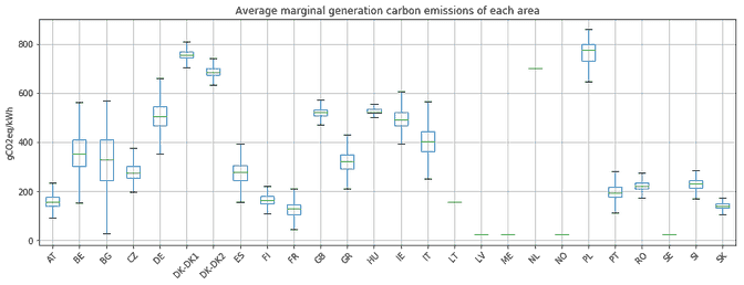
Using the knowledge of where marginal electricity comes from (using the topology matrix), we can infer the typical marginal carbon intensity of each area:
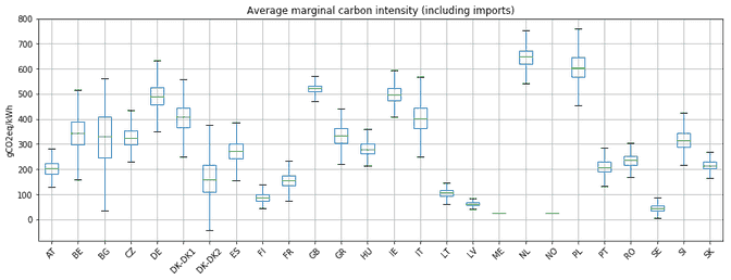
Note the interesting case of Eastern Denmark (DK-DK2) which has a lower marginal carbon intensity when imports are included. This is due to marginal imports from Sweden that are mostly low-carbon hydro power.
Note that those figures only show the average situation. As the European system is highly interconnected and powered by intermittent renewables, the hourly values can fluctuate significantly.
In summary, we have developed a methodology that enables us, without using prior knowledge, to estimate the carbon impact of increasing or lowering electricity demand in a certain area.
This signal should not be used to guide our choices as flexible consumers and we refer the reader to the other blogs of our series to learn more about what to consider when aiming to use marginal emissions factors.
Read the first article that introduces the concept of marginal emissions factors and some of their complexities, or dive into the next one where we discuss latest developments in our marginal technology.
This article had originally been published on 07/03/2018 and has been updated on 14/01/2025.

