Explainer
Back
How we run the Electricity Maps data pipeline at scale in the cloud
Our data pipeline takes all raw electricity data, processes it, and outputs clean data that powers our app as well as historical data and forecasts served through our commercial API. This pipeline is therefore the central piece of infrastructure of Electricity Maps because all data needs to go through it before anyone can use it or see it.
Felix Qvist

At the core of Electricity Maps lies the processing of large amounts of electricity data. For every zone supported, we fetch multiple data entries regarding production breakdowns, capacities, prices, exchanges, forecasts, etc.. for each hour of the day, all year long. Our data pipeline takes all raw electricity data, processes it, and outputs clean data that powers our app as well as historical data and forecasts served through our commercial API. This pipeline is therefore the central piece of infrastructure of Electricity Maps because all data needs to go through it before anyone can use it or see it.
The job of the data pipeline is to process electricity events (representing a measurement at a given point in time) and to yield regular and consistent data entries. An electricity event can contain information like the production mix or the exchange flow between two zones and these events come from a wide range of data sources. Each data source has a different data measurement frequency meaning that some events are measured every 15 minutes, some hourly, and some aren’t even measured periodically. Using this data, the pipeline’s task is to aggregate production and exchange measurements into hourly consumption data for each zone, taking into account electricity flows over the whole power grid.
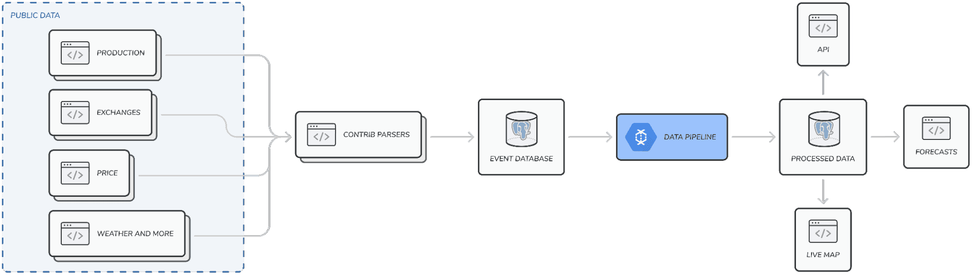
The output of the pipeline is a so-called grid state, which represents the state of the power grid during a specific time period. The grid states that we want to generate can be represented as a graph with the nodes containing information about the zone such as production mix and electricity price, and the edges represent the flow of electricity between the zones.
The biggest challenges that the pipeline has to solve are:
The data measurement frequency is different for each data source. We therefore need a way to efficiently align the data so that we can produce hourly grid data.
To compute the origin of electricity, we need data for the whole grid at once. This is due to the fact that the whole grid is interconnected, meaning that production in e.g. Spain could affect the resulting origin of electricity in Denmark. This makes it challenging to distribute the computations across workers because we can’t look at electricity events independently.
We recently rebuilt the data pipeline to better support the scaling up of Electricity Maps coverage and traffic. The old pipeline was limiting because:
It lacked horizontal scaling. This meant that all computations were computed on a single machine. This worked well for smaller datasets, but we have over the past years added hundreds of zones and exchanges with the help of our amazing contributors. Over time, the pipeline has slowed down to the point where it took up to 14 days to process the entire dataset.
It lacked a good testing setup. This made it cumbersome to make changes because we had to spend a lot of time manually testing changes to ensure that we didn’t introduce any regressions.
The new pipeline is built using Apache Beam, allowing the distribution of the workload across many workers, and consequently, speeding up the processing of the data significantly. Furthermore, the pipeline was developed using test-driven development which enabled faster iterations and simplified debugging.
But how does the pipeline actually work? Let’s take a look under the hood.
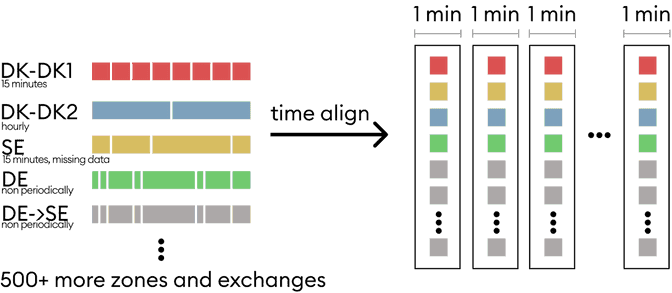
Align data into 1-minute grid states
As previously mentioned, the first challenge in the pipeline is that the input data has many different measurement frequencies. We therefore need a way to efficiently align the data with respect to time to then produce grid states. The pipeline starts by processing events by distributing them into grid states at a 1-minute resolution. These grid states will then later be aggregated into hours (and potentially into any other time-resolution required).
An additional caveat is that some data is delayed, meaning that we might retrieve the event some time after the measurement has happened. To overcome this, we introduce a validity period for each event. Events will only be considered within their validity period, and if a new event hasn’t come in within the validity period, we will consider the event in that grid state as a missing data point. This enables us to compute a temporary grid state while we’re waiting on events.
In order to align events into 1-minute grid states, a naive solution in a non-distributed environment would be to sort all the events and then slowly iterate through each minute and pick the latest non-expired event for each zone/datatype. This would be very inefficient in a distributed environment because that would mean sending all events to all workers.
Luckily, apache beam has some smart windowing functions that allow us to keep a sliding window that outputs the last x minutes of data in every minute bucket. x, in this case, is the validity period of the events, and we therefore only process events that could be valid in the given bucket. This way, each worker only needs to iterate through a much smaller dataset to find the right events.
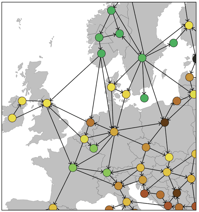
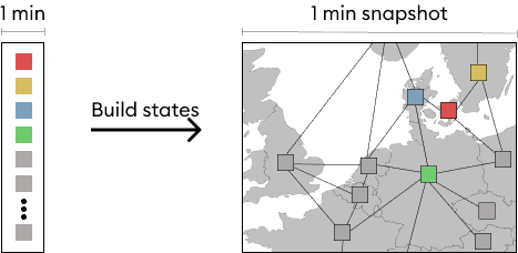
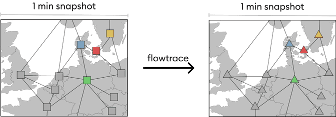
Build the graph representation
With the events grouped into 1-minute grid states, we can build a graph of all the zones in the grid. Note that the edges in the network are the electricity flows which are part of the input stream. For simplicity, they are omitted from the following figures.
Run the flow tracing algorithm
With the grid states built, we can run the flow tracing algorithm to compute the origin of electricity. Since the events are now cleanly separated in many grid states, we can parallelize by timestamp and do computations on each grid state on separate workers. The flow tracing algorithm itself is described in another blog post here.
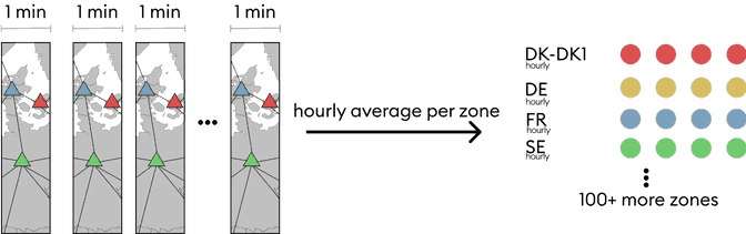
Compute hourly averages
As the last step, we can now compute the hourly averages for each zone before storing the data in the database and serving it to the rest of the system. We do this because a single grid state isn’t representative of the whole hour. Electrical grids as modeled by these grid states can typically have a high sub-hourly variability, and thus one might get unlucky and use a non-representative minute of the given hour.
This step is also distributed across many workers using Apache Beam, as we can simply group every hour and then compute the hourly averages on separate workers. At this stage, we could group by arbitrary timescales (5-min, 15-min..) or even output weekly, monthly or yearly data.
So why did we rebuild the pipeline?
Performance
The old pipeline lacked horizontal scalability. It could take us up to 14 days to reprocess the entire dataset, which meant that a zone would be offline for a long time if we decided to change the data provider or make other changes. We can process the same data in a couple of hours with the new pipeline!
Maintainability
The old flow tracing pipeline was one of the oldest pieces of infrastructure in the Electricity Maps codebase. Over time this had resulted in the pipeline being too difficult to maintain. We weren’t comfortable making changes because the risk of breaking something was too big. A bug could mean that we miscalculated values which could propagate the error throughout the entire system because everything depended on the processed data. Therefore, it was very cumbersome to make changes because we had to spend a lot of time testing it until we were comfortable pushing the change.
We ensured that all the transformations were decoupled entirely with the new pipeline. This makes it easier to manage complexity because new features can be added as a decoupled transformation that we can delete again without breaking anything. Furthermore, we have put a lot of effort into adding automatic testing of the pipeline, which gives us higher confidence that we don’t introduce regressions.
Snapshot tests have been especially helpful in helping us avoid regressions. Due to how data-dependent the computations are, it is really difficult to capture everything in unit tests. Snapshot tests work by saving a “golden master” that we manually validate. Then after each change, we can see if the output changes unexpectedly.
Scalability and future work
We envision Electricity Maps as being able to provide the most accurate and granular data available. The challenge is that as we increase granularity, the amount of data that we have to process increases greatly. We needed a pipeline that is able to continue scaling as we improve the data granularity.
Another important feature that we are planning to implement is stream processing. With stream processing, we will be able to reduce the delay between us receiving the data to being able to service it through our app and API. The abstractions provided by Apache Beam SDK work with both streaming and batch processing which will make it a lot easier for us to implement stream processing in the future.
Migrating to the new pipeline
Swapping out the most central piece of our infrastructure was a bit nerve-wrecking. We not only had to ensure that the new pipeline was stable, but we also needed to ensure that it didn’t cause any miscalculations. It would obviously be very detrimental if the new pipeline silently produced wrongful values in certain edge cases.
Even though we had implemented a thorough and solid set of tests, all showing that the new pipeline behaved as expected, the complexity brought about by the large data dependency meant that it was difficult to be 100% certain that these tests captured all edge cases. A YOLO release, therefore, wasn’t really on the table.

Our strategy was to deploy both pipelines in parallel and have them write into two separate databases. This way, we could monitor that the pipelines given the same input produced the same results.

Throughout the next weeks, we used a notebook to compare the results of the two pipelines. This allowed us to find the discrepancies between the two results so that we could investigate them further and understand why they were happening. Since there’s a lot of data, it is difficult to compare them 1-to-1, but using things like distribution analysis we got a really good indicator about the maturity of the new pipeline. After monitoring the pipelines for a while and fixing the edge cases identified, we were finally confident enough to flip the switch and point our services towards the new database.
Monday morning, we gathered the team for some delicious croissants so that we could press the release button together and watch the pipeline crunch data faster than ever before 🚀